
Redesigning Tinder
2-week Learn & Work Sprint @
General Assembly UX Design Immersive
1-15 SEPT 2021
CHALLENGE
Redesign two touchpoints of an existing business
TOOLS
Miro
Figma
Google Survey Forms
ROLE
UX Designer
UX Researcher
Project Manager
TEAMMATE
Kuoloon Chong
OVERVIEW
A conflict of User & Business Goals
As users grew accustomed to Tinder being a normalised part of dating, people became increasingly apathetic and desensitised throughout the whole process of meeting someone new, forging and maintaining a connection. Ultimately, the goal of a dating app user is to find 'the one' and eventually leave the platform forever.
Meanwhile, the business thrives on users returning to the app to continue swiping as it functions on a freemium business model - earning through making money through ad revenue and paid membership subscriptions.
This project aims to reconcile user needs with business goals by leveraging on existing user behaviours to match users — thereby promoting deeper and longer lasting connections — and creating alternative revenue streams for the platform.
Design Process Overview
DISCOVER
Business Analysis
Survey
User Interview
DEFINE
Affinity Mapping
User Persona
Problem Statement
UT #1
DESIGN
Ideation
Sketching
Wireframe
Prototype
UT #2
DELIVER
Reiteration
Style Guide
Next Steps
Getting down to Business
With Tinder facing fierce competition from Bumble (with market shares rising steadily from 10% to 17% from 2017 to 2020, while Tinder remains stagnant at 40%-43%), we looked at how Tinder stacks up against its direct competitors, while also analysing what makes indirect competitors work.
Competitive Analysis: Pluses & Deltas
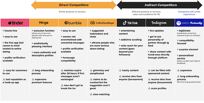
🔎 LEARNING #1
NO to gimmicky product features
While Tinder's direct competitors have some kind of USP that makes them distinct, their 'unique' features such as limited matches and timers can come across as gimmicky. Our goal is to own a simple yet unique product feature that is grounded in a strong human insight while providing user freedom and control.
🔎 LEARNING #2
Learning from Tiktok & Instagram
Content-sharing serves as a quick way to break the ice and express one's personality. Tinder could leverage entertainment content to connect it users, instead of them having to go through long onboarding processes such as questionnaires to craft their online dating personas.
Understanding the User
To understand user motivations, processes and past experiences, we conducted an anonymous survey and user interviews - recruiting users who have had experience with at least one dating app.
User Research Methodology
Survey gathering qualitative data of general dating app usage habits and preferences with 16 participants. User interview with 9 participants (5 men, 4 women).
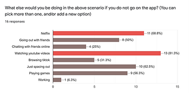
User Research Key Insights
Boredom is the biggest emotional trigger causing users to get on the app

They would otherwise be on Netflix or YouTube
Users are looking for connections that go beyond skin deep
through shared interests and personality displayed on profiles, citing boring, repetitive conversations as a common problem on Tinder.

"I matched with him cos his bio was funny. Seems like can hold a convo with"
"if someone mention anime, then it's a talking point"
"I stalk their IG to get a better idea of their personality before chatting with them."
Wariness of catfishes 🥸
Tinder is rife with fake accounts, and users need assurance that their matches are real before connecting with them.
"the thing i dont like about tinder: a lot of scam profiles"
"Experienced a few catfishes before. tried to ask me to sign up on some investment link.."
"Can tell the profile photo is fake, so i swipe left"
Defining the Problem
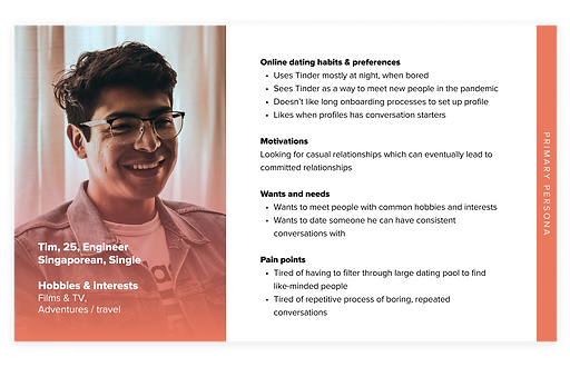
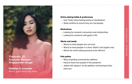
Through synthesising our research findings, we identified 2 main themes: a primary persona who is looking to meet like-minded people, and a secondary persona who is a little bit more jaded. This led us to our 2 main statements.
Problem Statement #1
Tim, who is sick of boring conversations in the online dating process, needs to meet like-minded people with common interests but there are too many other profiles to filter through.
Problem Statement #2
Tinderella, who doesn’t have many opportunities to meet people in her daily life, needs to know her online matches are real so that she can decide whether they are worth her time getting to know them better.
Evaluating the current App
Methodology
Heuristics Evaluation & Usability Testing with 5 participants (3 female, 2 male), aged 21 - 27, have used at least 1 dating app before. Measured with Single-Ease Question (SEQ), on a 7-point scale (1=Very Difficult, 7 = Very Easy)
Solutioning
With a clear understanding of our users' needs, we set out to ideate while keeping business goals in mind.
BUSINESS GOALS
Differentiate from competitors by creating a unique product feature
Generate revenue without relying on paid subscriptions as most users are unwilling to pay for them
UX GOAL
USER GOALS
Forge meaningful connections with like-minded matches with similar interests, without having to sift through a large dating pool peppered with catfish accounts
Browse descriptive profiles of other users who match their criteria
💡 SOLUTION #1
Connecting like-minded users
To more effectively match users of like-minded qualities, we leveraged on an existing behaviour of users frequenting content sites such as Netflix & Youtube - a key insight uncovered during user research.


Even though Tinder has a website, our research revealed that users do not use it. To reach users right where they are doing what they love, we created a plugin that integrates with their popular entertainment sites (Netflix, YouTube, Disney Plus, online concerts and gaming platforms) to connect those similar tastes and interests, serving as an immediate icebreaker to keep conversations flowing.
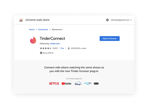
This works well in the new normal, where we are primarily getting our entertainment and social fix from home. Additionally, it's a more effective way to showcase one's personality as compared to filling in long questionnaires about preferences and tastes.
A quick sense check...
With concerns of privacy cited by our assistant instructors when we shared our idea with them, we conducted a quick survey with 14 participants to gather user sentiments around this new product prior to getting started. Half of participants expressed concerns about being disrupted during their content viewing.
No sweat though, as we have already planned for this.


Wireflow
TinderConnect Browser Plugin
Easy Setup Process

💡 SOLUTION #2
Streamlining the Mobile Experience
Recapping the main problems of the current Tinder app:
-
A lack of depth in users' profile content makes it harder for users to match and connect
-
A focus on paid subscription and random ads makes it feel less human and authentic
How Might We:
-
Allow users to browse a more curated feed?
-
Make the mobile app work seamlessly with TinderConnect plugin?
-
Cultivate a platform with descriptive and thoughtful profiles?
-
Create an alternative way to generate revenue?


Wireflow
New & Improved Tinder App
Advanced filters to prevent swipe fatigue
Filters such as intentions and height were added in response to user feedback from UT#1, while a filter for TinderConnect was added to seamlessly integrate both touchpoints.

Testing & Iterating
We conducted two rounds of UTs (a total of 4 users) with our plugin and mobile prototypes. While overall sentiments and SEQ scores faired pretty well, it was important to look past the scores and dig deeper to find areas of improvements based on participants actions and comments.
Key Iterations
UT Finding
1/3 users did not register the Netflix icon on match's profile as something they shared in common
Iteration
Revised position of Netflix icon to be on profile info instead of photo, and added TinderConnect logo to be more explicit.


Visual Design
A friendlier look
Using a combination of brand colours, rounded corners, layering and shadows to create depth.

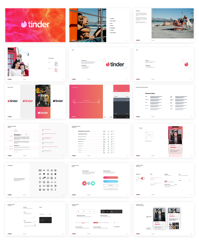
Creating a UI Style Guide
Created after iterating on wireframe designs, the style guide is a living document that should be updated when the project progresses, to ensure consistency across icon styles, typography, UI pattern library and components moving forward.
Next Steps
✏️ DESIGN
An onboarding for TinderConnect
Since the plugin is a new product, an onboarding session upon downloading it for the first time will help users get familiarised with how it works.
Sound Design
Work out notification sounds for plugin and allow users to enable/disable.
🔎 RESEARCH
Mass survey to determine app filters
During UT, one user mentioned wanting to see a filter for dietary restrictions.
In order to not go overboard with filters by adding one each time it's requested for, we could conduct a mass survey with 50 participants of different race, gender and religion to determine 8-10 most important ones to include.
🔁 ITERATION
Events function
Based on UT findings, we should allow users to explore more events after clicking into events message received.
Reply messages
Allow users to swipe right on messages to reply.
Thoughts & Reflections
👀 Learn from Indirect Competitors
Analysing indirect competitors can help tackle a problem from a different, but effective angle.
✅ Test early on
When creating a new product, it's good to do a quick and dirty survey even before any designing, to validate any potential sentiments and prep for any negative ones.
💬 Working in a team
Clear communication is paramount in a teamwork setting. e.g. Running each other through user interview findings and being clear and concise on post-it notes on the affinity map.
🌀 Trust the process
At the start of the project, I was worried that we might not be able to do justice to how 'interesting' it sounded to redesign Tinder. As one of the project requirement was to redesign 2 touchpoints of Tinder, I was at a lost of what to do with the Tinder website - which no one uses. However, once we got down to the research and define phases, it was clear which direction we should head in. It was an exciting process uncovering trends in our user research and finding ways to reconcile user habits and preferences with their agenda on dating platforms.